Tuesday, December 13, 2011

Fondue, Wine and Lighting


Last night we ate an amazing meal 
at Skati's.  We met the chef, Ian, when he came 
to investigate the bottle of wine that we brought.
It was a wonderful 1986 Bordeaux.
The dessert was to die for too--pannacotta
with lemon curd.  This dessert is probably
one of the best I've ever had.


 So, not only is the food amazing at Skati's,
the ambiance is wonderful too.  The lighting
is very dim just the way I like it.  There
is a lot of candle light--sort of romantic.


Skiing was amazing!  At first I felt so awkward!!
Somewhere along the line I hit my groove. I think
I was skiing faster then ever before.  Later
in the day it started to snow.  It was cold, but 
beautiful.

Dinner tonight was fondue and salad.  I
made it and scored 3 stars (wink).

Now I'm sitting here by the fire feeling
quite content.

Hope you all had a great Monday!  I'm
feeling very spoiled!!


Monday, December 12, 2011

Ski Chic


SO, IF I'M GOING SKIING, I'VE GOT TO HAVE SOMETHING FUN TO WEAR, RIGHT?


What do you think of this little number?
I love the color!  Why am I so attracted
to grey?


Faux Fur is always fun!

Do models always look cranky because they haven't eaten?

Cute??

So Chic!

Love it!


Okay, these are not my sons, but it could be :)


Do you think they are going to be warm enough??

So, this is the boot I bought.  I was so wanting some
faux fur!!  It is from Sorel.  They had loads to choose from.

There you go.  Isn't skiing mostly about the clothes?


Sunday, December 11, 2011

Lighting at the Monache


HAPPY SUNDAY


So, I get to go skiing for a couple of days.  

I like to think that I look this hot when I'm carving up the 
slopes. (wink, wink)  I use to embrace the philosophy
that even if I wasn't the best skier on the Mountain,
I could at least dress the part.  Now, I just feel 
fortunate if I'm warm enough and don't fall down.

We stay at the Westin Monache.  It is the newest
hotel/condominium project in Mammoth.  Of course,
I can't go anywhere without analyzing the lighting.  
The lighting gets an A+ in my book.  It is layered 
well and shows all of the architecture perfectly.


In the summer it was fun to sit in the jacuzzi, but it might
be too cold this trip.  I'm told the ground has a heating
system.  It helps to keep the paths free of snow--very cool.

The lobby has amazing lighting.  Behind the front desk
there is a sculptural piece of the Devil's Post Pile.  There
are down lights that graze the front of it.  As you can see
from the picture below, over the seating area there are loads 
of pendants and the wall has a niche area with faux candles.  
It's all done really well.  

Lighting makes such a difference!

I'm wondering if they are decorated for Christmas.

Hope you are all enjoying this season of lights!!


Saturday, December 10, 2011

Coffee in Mexico

IT'S SATURDAY!!

I'm wishing you all the perfect start to your day...
and the perfect cup of coffee.

Mentally, I'm still in Mexico.  Scroll down for one
designers take on a coffee shop in Mexico.  I'm loving
the colors.


Here is a traditional chandelier that you might
see in a Mexican Style Interior


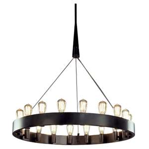
Here is Robert Abbey's take on that same chandelier.
This feels very contemporary with the Edison bulbs.


So, what do you think of the Mexican Coffee Shop?


Thursday, December 8, 2011

San Miguel de Allende

 San Miguel de Allende


Through One Kings Lane, I discovered an interior designer of whom I'm
truly jelly (my son's term for jealous).

Rachel Horn is an L.A. based designer who also lives in San Miguel 
de Allende.  Every time I see this amazing Spanish Colonial town featured 
in a beautiful design magazine I start to swoon.  I so want to have a
home away from home there.

If Santa Barbara is quaint, then I imagine San Miguel de Allende
to be quaint on steroids.

Visit Rachel here.


Posh Presents


If you are looking for a gift for that special interior designer in your life,
Saladino Villa would be a great choice.  These two rooms are just beautiful!
I love the chandelier in this dining room space.  It is a little larger than the
American Lighting Association recommends and so it is also hung a bit
higher.  I think it works and is OH SO BEAUTIFUL!!

Look at the drapery in the next picture.  It looks like he used tapestry
at the top of his silk...AMAZING!!  That color of blue silk is just
dreamy.  To get this look you could choose a fabric from Debra at

Hope you have an enchanted day!!

Cindy  


Wednesday, December 7, 2011

Santa Barbara Beach House


In case you missed reading your copy of Veranda, I thought this was 
so beautiful that it warranted some additional press.  This home 
was designed by Hallberg & Wiseley and photographed by Miguel
Flores-Vianna.

Because this is a blog that focuses on lighting, I usually try to talk
about the fixtures and portables.  This is the exception.
This home has minimal electric light and depends largely on
California's amazing sunlight.  How green is that??